What makes a landing page different from every other page on your website? After all, can’t leads “land” on any page? Every page on your website should be designed with a specific goal or outcome for the visitor that will ultimately nurture them along to becoming a client. That is why having a high converting landing page is so important!
Your home page introduces your business to the visitor while giving them an overview of what they can expect the content on your website to cover. Your “About Me” page shares personal stories and details that help visitors get to know you. Your landing page is there to inspire visitors to take action and “convert” or sign up for compelling offers by giving you their contact info.
By the end of this blog you will understand what is so important about designing compelling landing pages and what the 7 key elements are that will nurture your leads to take action. To demonstrate the key elements of a landing page that will lead you to higher conversion rates we’ll analyze my highest converting landing page together.
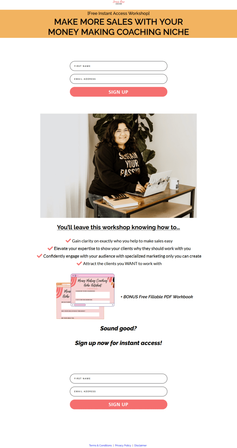
1) Attention grabbing headline that immediately conveys the benefit of signing up

The importance of an attention grabbing headline can’t be understated. It’s likely the very first encounter someone will have with your business and needs to immediately convey the benefit they’ll get from signing up to your email list. Oftentimes it will cut right to the pain point by telling them what will change in their business like on my landing page. “Make More Sales With Your Money Making Coaching Niche” In this example making more sales is a necessary outcome for every coach and will attract anyone who is struggling to meet their sales goals.
2) Sign up form "Above The Fold"
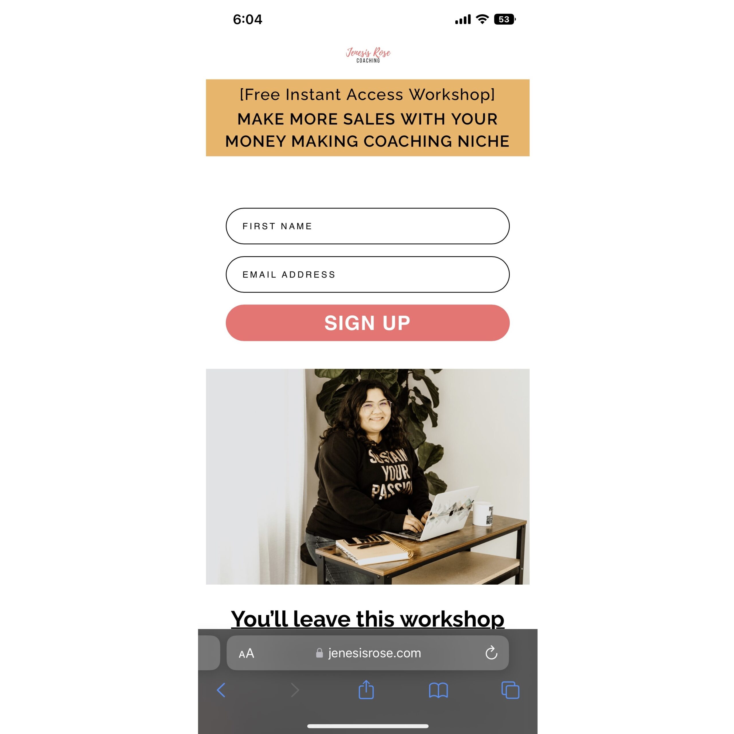
In addition to capturing a visitor’s interest with the title, it should also be as easy as possible for them to sign up right away. “Above the fold” simply means that the content will be shown without having to scroll on the page. By including a signup form above the fold, anyone who is clicking to the page who is already intent on signing up will be able to do so without any distractions.
3) Image of yourself for familiarity

Now, your picture doesn’t HAVE to be of you… But if you’re a coach then what you’re selling is really yourself! Any good landing page will have some captivating image above the fold that is relevant to what they’re signing up for. Having this image of yourself creates a sense of familiarity for visitors and also brings personality to the page.
4) Explanation of outcomes (bullet points)

5) Image of what they're signing up for
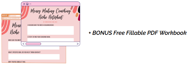
On this particular signup I included a freebie that follows the workshop so they can have their own booklet of answers to look back on. Including an image of this freebie helps continue to build familiarity and gives visitors a glimpse at what they can expect to receive in exchange for their information.
6) Call to action

Finally, at the bottom of your landing page you should have a clear and powerful call to action. On my landing pages I like to include a question that will help reinforce their interest in the content. “Sound good?”. If it doesn’t sound good then they’ll move on, if it does sound good then they’re probably already signing up. If they’re on the fence? Asking this question might help them rationalize that the content is inspiring to them and is worth checking out.
Follow this question with a clear call to action like “Sign up now!” that will compel visitors to immediately take the desired action.
7) Terms & Conditions/Privacy Policy
Make your high converting landing page today!
Now that we’ve worked through my highest converting landing page I hope you understand the 7 key elements to creating high converting landing pages and how you can implement these ideas on your own pages.
